
Restaurant Website Must-Haves: What Diners Look For
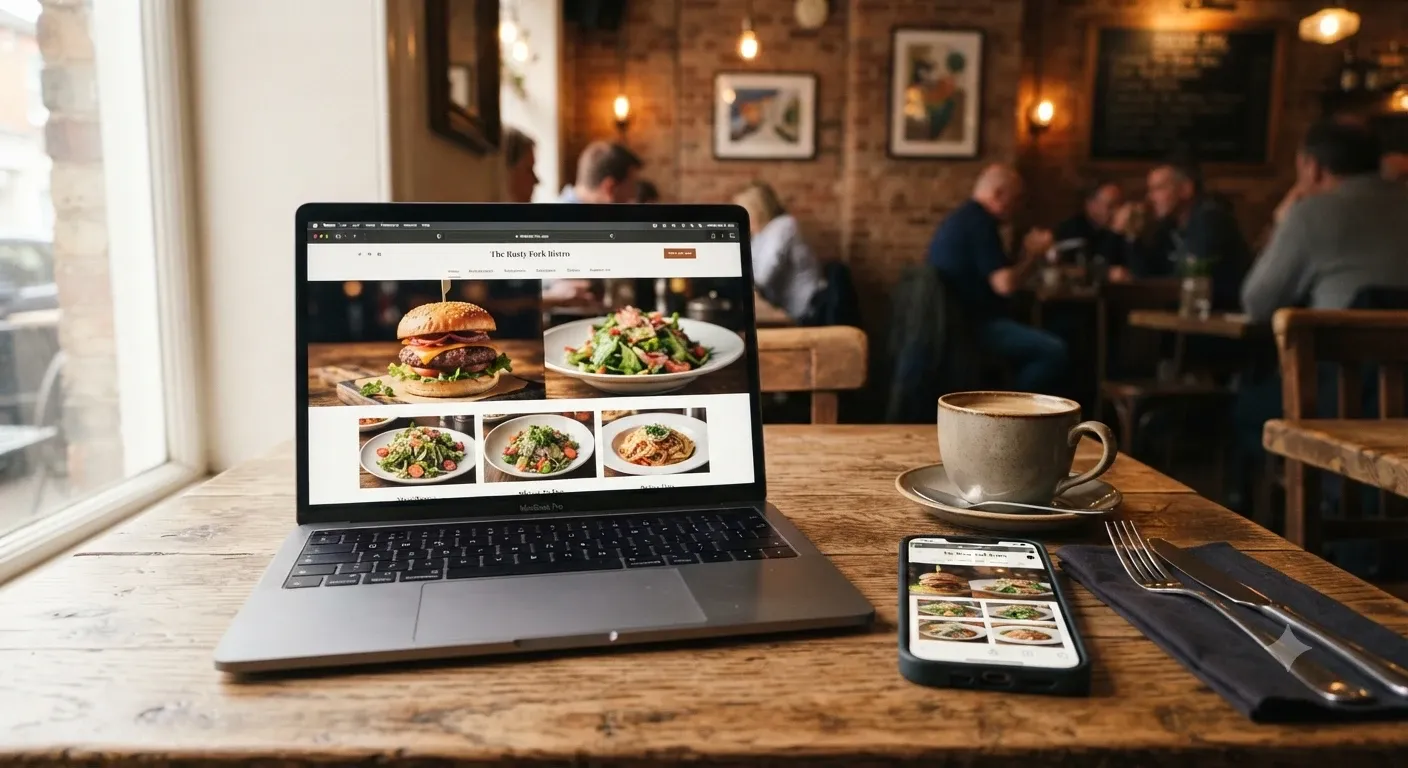
Picture someone deciding where to eat on a Friday night. They have three places in mind, a few minutes to choose, and a phone in their hand. Whichever restaurant answers their questions fastest usually wins.
That's not a guess. In a 2019 survey of more than 1,100 US adults by the marketing agency MGH, 77% of diners said they're likely to visit a restaurant's website before dining in or ordering takeout. Of that group, 68% said a website had put them off visiting a restaurant at least once. Your site isn't a digital business card anymore. It's part of the decision.
So what are diners actually looking for? Below are the restaurant website must-haves that matter most, in roughly the order guests care about them.
A Menu That Loads Fast and Reads Easily
The menu is the main reason people visit your site, and it's the main reason they leave. In the MGH survey, not liking the menu items was the top reason diners skipped a restaurant. You can't fix that with design, but you can make sure a bad menu experience isn't what sends them away. About 30% said a hard-to-read menu had discouraged them from visiting.
A few things make a big difference:
Use real text, not a PDF. PDFs are slow on phones, awkward to zoom, and harder for Google to read. A plain HTML menu works better for guests and for search.
Show prices. Diners want to know if dinner is $20 or $80 a head before they commit. Hiding prices tends to feel like a red flag.
Keep it current. Nothing frustrates a guest like driving over for a dish that came off the menu months ago.
Mark dietary options. Simple labels for vegetarian, vegan or gluten-free dishes help people with restrictions say yes quickly. Add a note on how to ask about allergens.
A Site That Works on Phones First
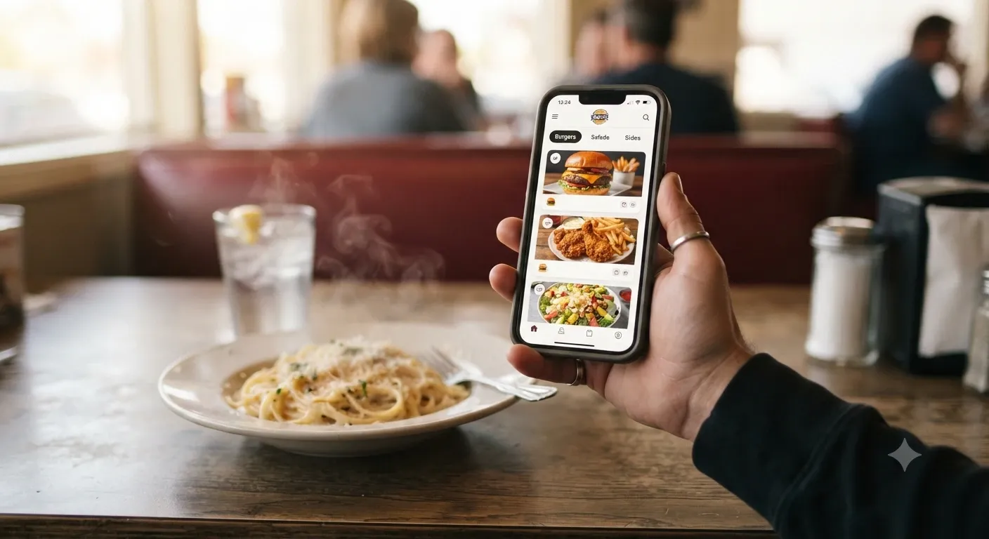
Most restaurant searches happen on a phone, often while someone is already out. In the same MGH survey, 56% of diners said a mobile-friendly website is very important to them.
Mobile-friendly means more than shrinking the desktop version. Buttons should be big enough to tap with a thumb. Text should be readable without pinching. The phone number should be a tap-to-call link. And the page should load in a couple of seconds, which usually means compressing images and skipping heavy sliders or autoplay videos.
A quick test: open your site on your own phone, on cellular data, standing outside. If anything feels slow or fiddly to you, it feels worse to a hungry stranger.
Food Photos That Look Like the Real Thing
People eat with their eyes first, and your website is where that starts. MGH found that 45% of diners specifically look for food photos on a restaurant's website. Younger diners care even more, with 59% of 18 to 24 year olds saying they look for them.
The catch is that bad photos can hurt you. Dark, blurry or obviously stock images make a place look careless. You don't need a huge budget, though. Shoot near a window in daylight, keep backgrounds simple, and photograph your best-selling dishes the way they actually come out of the kitchen. Honest photos set the right expectations, which matters when guests show up and compare.
Hours, Location and Contact Info Up Front
This sounds obvious, yet plenty of restaurant sites bury their hours on a separate page or in the footer. Put the basics where nobody has to look for them:
Your address with a link that opens in Google Maps or Apple Maps
Opening hours for every day, including holiday changes
A clickable phone number
Parking tips or the closest transit stop, if it's not obvious
Keep these details identical across your website and your Google Business Profile. Toast's diner research found that 46% of people check Google Reviews first when looking up a restaurant, so many guests will see your Google listing before your site. If the hours don't match, they won't know which one to trust.
Online Ordering and Reservations Without the Runaround
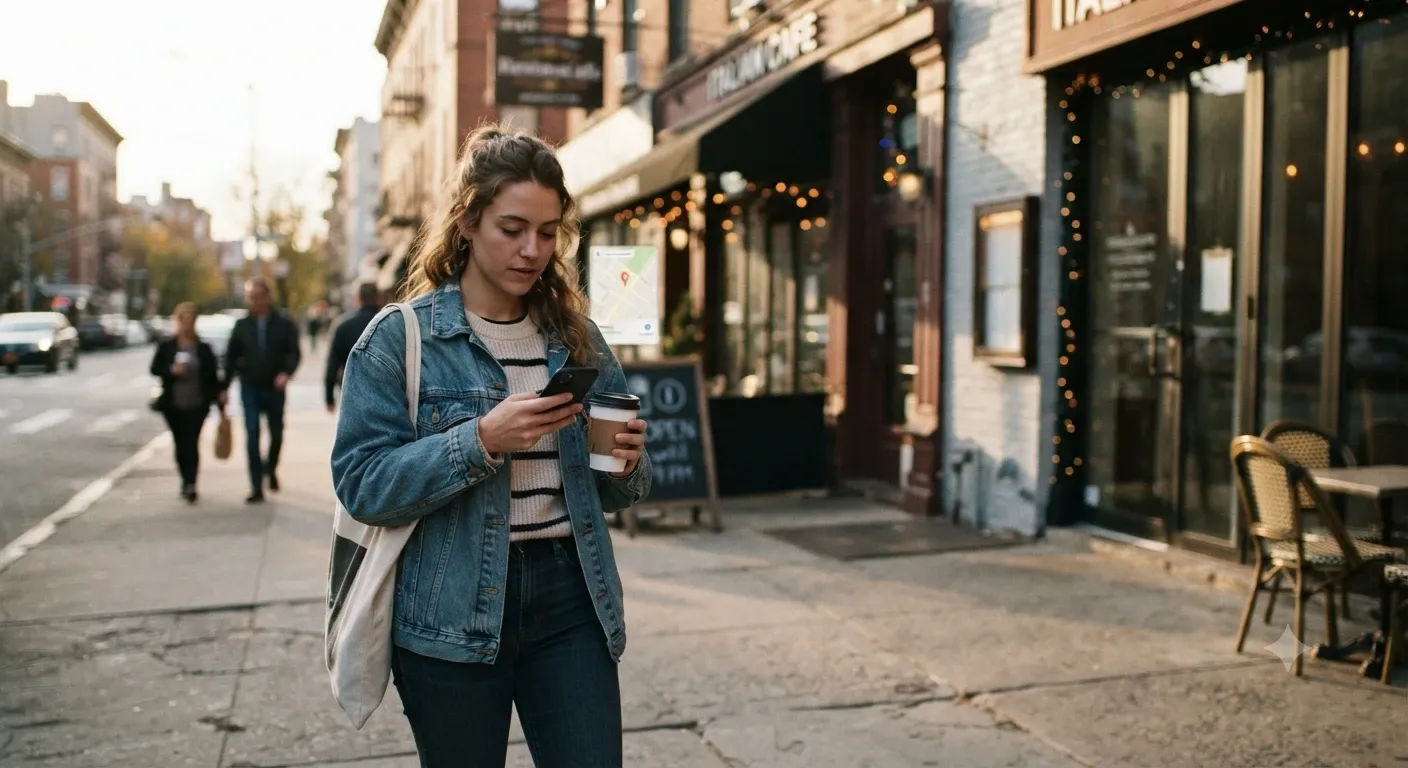
In the MGH survey, 43% of diners said they use a restaurant's website to decide whether to order takeout or delivery. If they decide yes, the next step should be right there.
Put a clear "Order Online" or "Book a Table" button near the top of every page. If you use a third-party tool like OpenTable, Resy, Toast or ChowNow, link straight to your page on it so guests don't have to search again. Where possible, offer direct ordering as well. Delivery apps charge restaurants commission on each order, so steering regulars to your own ordering link can protect your margins.
Clear, Simple Navigation
Diners aren't there to explore. In the MGH survey, a third said a hard-to-navigate website had discouraged them from visiting a restaurant. Five or six menu items is plenty for most places: Menu, Order, Reservations, About, Contact, and maybe Private Events.
Skip splash pages, music that plays on load and pop-ups that cover the whole screen on mobile. Each one is another reason for someone to tap back and pick the place down the street.
A Fresh, Up-to-Date Look
About 30% of diners in the MGH study said a website that looked old or out of date had turned them away. An outdated site makes people wonder if the restaurant itself is still open, or still good.
Freshness comes from small, regular updates as much as from design. Update the seasonal menu, swap in new photos, post your holiday hours, and remove events that already happened. A copyright year from 2019 in the footer says more than you'd think.
Your Story and Some Social Proof
Once the practical questions are answered, guests want a reason to pick you. A short About section helps: who runs the place, what you cook and why. Keep it to a few honest paragraphs rather than a long history.
Social proof works too. Link to your Google or Yelp reviews, add a press mention if you have one, and share your Instagram if it's active. Only show real reviews, and don't edit them to sound better.
Accessibility for Every Guest
An accessible website lets everyone use it, including people who rely on screen readers or keyboard navigation. It's also a legal consideration in the US. Courts have applied the Americans with Disabilities Act to business websites in some cases, and restaurant chains have faced lawsuits over sites that blind users couldn't navigate. The Supreme Court declined to hear Domino's appeal in one such case in 2019.
The basics aren't hard. Add alt text to images, use real text instead of menu images, keep strong color contrast, and make sure every button works with a keyboard. The WCAG guidelines are the common reference point if you want to go further.
Restaurant Website Must-Haves at a Glance
Must-Have | Why Diners Care | Quick Fix |
|---|---|---|
Readable online menu | It's the top factor in their decision | Replace PDFs with an HTML menu that shows prices |
Mobile-friendly design | Most searches happen on phones | Large buttons, tap-to-call, compressed images |
Real food photos | Shows what they'll actually get | Shoot best sellers in natural light |
Hours and location | They need to know you're open and how to get there | Put them in the header and match Google |
Ordering and reservations | Lets them act right away | Add a clear button on every page |
Simple navigation | Nobody wants to hunt for info | Keep the main menu to five or six links |
Accessibility | Every guest should be able to use your site | Alt text, contrast and keyboard-friendly buttons |
Build a Restaurant Website Diners Actually Use
Think of your website as your host stand online. It should greet people, answer their questions and get them seated or ordering with as little friction as possible. Start with the menu and mobile experience, since those carry the most weight, then work through hours, ordering and the rest.
If you're starting from scratch or your current site feels dated, AzurePress lets you build a clean, mobile-ready restaurant website with a visual editor, so you can update your menu and hours yourself whenever things change.
Frequently Asked Questions
What should a restaurant website include?
At minimum: an easy-to-read menu with prices, your hours, address and phone number, a mobile-friendly layout, good food photos and a clear way to order online or book a table. An About section and links to reviews help guests choose you.
Should my restaurant menu be a PDF?
It's better not to. PDF menus load slowly on phones and are hard to zoom and read. An HTML text menu is faster, easier to update, more accessible and easier for search engines to understand.
Do diners really check restaurant websites before visiting?
Yes. In a 2019 MGH survey of US adults, 77% said they're likely to visit a restaurant's website before dining in or ordering takeout, and most of that group said a website had discouraged them from visiting at least once.
Does a restaurant website need online ordering?
It's not required, but it helps. Many diners use a restaurant's website to decide on takeout or delivery, so a visible order button makes it easy for them to follow through. Direct ordering can also cut what you pay in delivery app commissions.
How often should I update my restaurant website?
Update it whenever your menu, prices or hours change, and review it at least once a season. Swap in fresh photos, post holiday hours early and remove past events so the site never looks abandoned.
More from the blog
 Website Ideas for Plumbers, Electricians and HVAC ContractorsA contractor’s website has one job, which is to get the phone ringing. Here are 14 practical website ideas for... · 7 min read
 AI Website Design Prompts: 25 to Build Your Business SiteBuilding a business website with AI works best when you know what to ask. These 25 copy-and-paste prompts take... · 8 min read
 MCP Connector Explained: How It Links AI to Your AppsAn MCP connector lets an AI assistant like Claude or ChatGPT work directly inside your apps instead of just ta... · 6 min read